Our Name and Wordmark
Our official name is typeset in a welcoming and distinct geometric slab serif. Both modern and friendly, the visual expression is polished and modern.
Whenever possible, we refer to ourselves as the “Ohio Chapter of the National Association of Pediatric Nurse Practitioners” or the ”National Association of Pediatric Nurse Practitioners.”
Research shows that current and prospective members feel the full version of our name is most reflective of our core values and strategic vision. The acronym “NAPNAP” should only be used:
- when name recognition is deeply understood and previously established,
- in casual communication,
- or in extreme cases, where the full name is not suitable (i.e., social media handles)
Our Hero Message: “Experts in Pediatrics, Advocates for Children”
A hero message is a brief line that describes what an organization does, for whom, and why. Our hero message, “Experts in Pediatrics, Advocates for Children,” demonstrates our deep experience, commitment to advocacy, and mission to serve children with the highest quality care. When communicating to new and existing audiences, we will apply the hero message to quickly convey our mission and to galvanize our purpose and values.
About Our Logo
The National Association of Pediatric Nurse Practitioners is charged with advocating on behalf of pediatric expertise and the well-being of children everywhere. It is important that our logo, the smallest expression of our mission, reflect those ideals.
The Shield
![]()
Since 1973, the National Association of Pediatric Nurse Practitioners has created value for its members through passionate support of pediatric expertise, education, and promoting awareness of the profession. Our Shield represents the trust and expertise embodied by our members and the protection we provide to the public. Inside the shield, our heart represents the holistic scope we embrace and the security we ensure for children.
Chapter Iteration: Logos
The National Association of Pediatric Nurse Practitioners’ strength is directly tied to the thousands of members actively contributing time to events and causes organized by association chapters founded across the United States. Key to building that strength is a unified visual identity embraced across all chapters. When communicating on behalf of our chapter, we will use the official association chapter lockups, logos created specifically for Ohio, such as:
![]()
![]()
Brand Color Values
The National Association of Pediatric Nurse Practitioners brand uses a clean and calming palette comprised of bold saturated colors and lighter neutral shades. Combined, they convey a feeling of patience, trust, and innovation. Cool blues align to the professionalism we bring to our work, our working environment, and the care we provide. Deep blue denotes our trust and expertise while light blue is energetic and friendly, adding a contemporary luster. How do I change the HEX color in Microsoft Word or PowerPoint?
- 1B75BB Dark Blue
- 00CBF3 Bright Blue
- F2EBD5 Tan
- D93611 Red
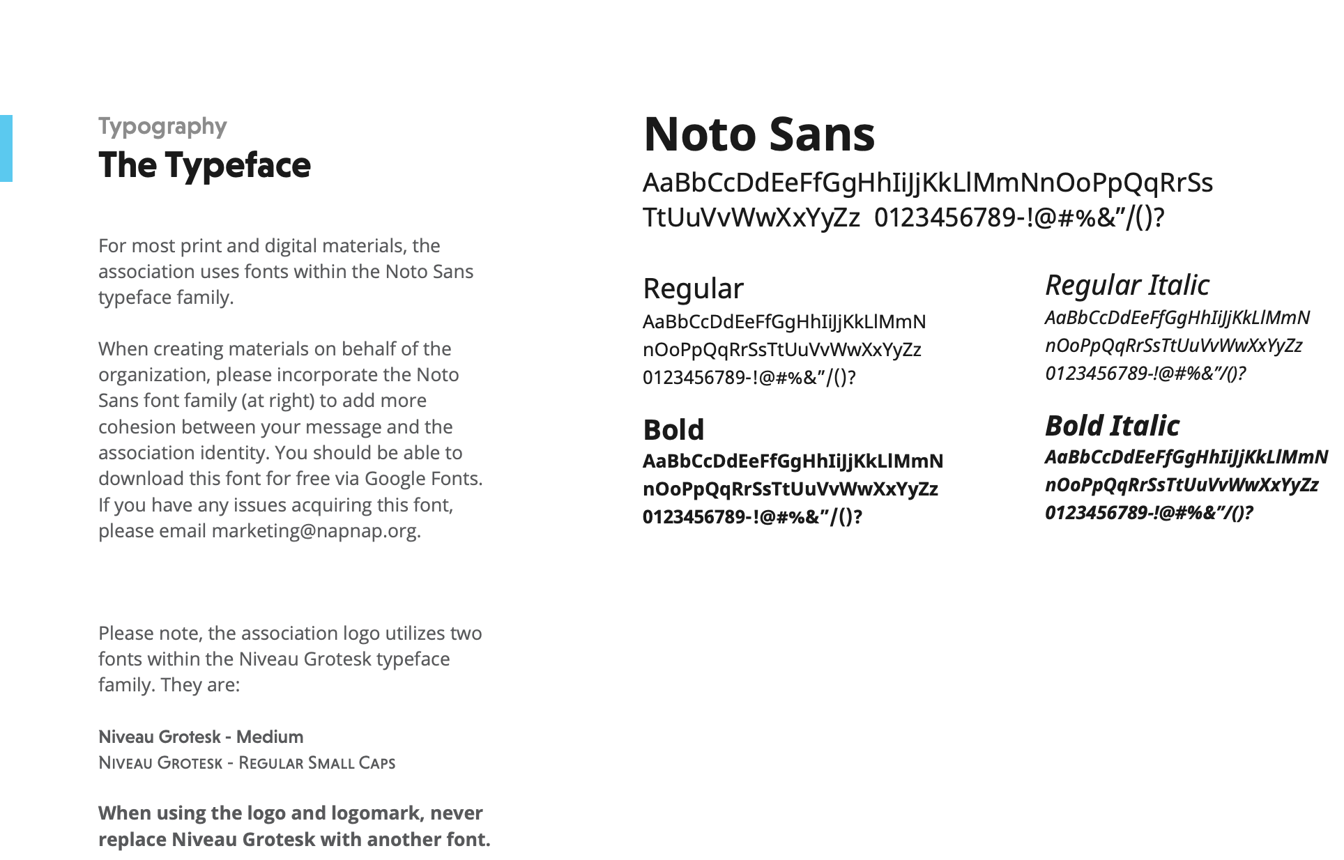
Typography: The Typeface (Fonts)
Fonts
Resources
NAPNAP Chapter Branding Guidelines
*The following resources are available via Ohio NAPNAP’s Google Drive: